
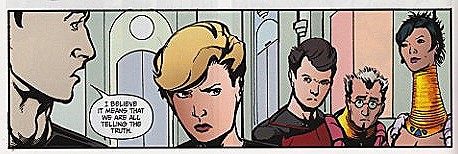
"The Space Between" #1, "History Lesson" by David Tischman & Casey Maloney, IDW 2007
I guess a lot has to do with the fact that ST comic books are often being read by people who rarely read comic books. If an artist does photorealistic portraits (and starships) from highly-recognizable colour publicity shots of the actors, some fans will scream that they've somehow been cheated, and they "may as well be reading a Fotonovel". On the other hand, if the artwork has an an unusual stylistic approach - even when totally in keeping with the themes/moods of the story - other fans will complain that "even my pre-schooler can do better".
I've very rarely been disappointed by a ST comic's artwork. It's the way it combines with the story that indicates its success to me, and any ST comic book (like TAS) is at its best when it aims to do things a live-action ST adventure can't afford to do.
I've certainly seen many mistakes over the years. A few ST comic books over the years have featured long sequences with "talking heads", or panels overly-filled with word balloons. And I recall the almost-overwhelming rejection of the rather unique style of Toby Cypress in WildStorm's DS9 comic mini-series, "n-Vector", a few years ago.
Interestingly, I picked up an old "Batman/Nightwing" crossover one-shot ("Bloodborne") in a "cheap bin" last week. I originally rejected buying it years ago because of the artwork but, last week, it suddenly dawned on me: "Bloodborne" was a Toby Cypress comic! There was my favourite superhero, Nightwing, rendered in the inimitable Cypress style. And I liked it! The artwork really suits that story.

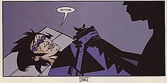
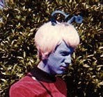
Tiris Jast by Toby Cypress; Nightwing by by Toby Cypress.
I've found the new TNG comic to have a very attractive artwork style. This issue is supposed to say: "First Season!", and it does that very well. The inked outlines are bolder than usual, but the characters' faces are always expressive, the colours appropriate and often vibrant, the SPFX blurring of a panel (to indicate motion) is extremely effective, and the alien landscapes are nicely... alien.
What else am I hoping to see from IDW? I guess I'm anticipating exciting, thoughtful stories that complement the themes and characters within whichever Star Trek era they happen to be set. As I said, I really enjoy comic tales that take full advantage of the comics medium, showing us things that a science fiction television or motion picture budget simply can't afford. Plus some cool appearances by representatives of the wonderful array of United Federation of Planets alien races, would be much appreciated: especially Andorians, of course, plus some Tellarites, Hortas - and those we so rarely see, such as from "Star Trek: The Motion Picture", "ST IV: The Voyage Home" and Filmation's animated episodes of the 70s.
Roll on issue #2. And the TOS Klingon story which is supposedly to follow the TNG mini-series.


4 comments:
Funny that you mention the art style since I almost didn't buy the book because the art looked so childish. After reading the book I'm still not convinced that the art style chosen is correct for TNG. I hope that reader response hleps IDW see that that some changes have to be made.
Thanks for the reply, Bruce. I'm not sure I'd use the term "so childish" for the art of "The Space Between" #1. Minimalist, perhaps, or clean, or boldly-inked, or not photorealism, but certainly not "childish".
I got to see a frame from #2 today, featuring Picard and an Andorian archeologist name Schwin - and the art looks great! Same penciller, I think, but finer inking.
"Stylized" is one thing, but this is not it. This is just bad. Perspectives are wrong, the people practically look like stick figures at times, and the faces are horrible, especially the eyes.
I buy between 20 - 30 comic titles a month, so I'm hardly a newb to trek or comics. I've seen some great art, and I've seen some bad art (thankfully rarely), and I have to say that this qualifies. Perhaps, like Humberto Ramos--whose art I enjoy only when he's not drawing Spider-Man--this style of art would fit better with something other than Star Trek.
I don't need my Trek comics to have photo-realistic versions of the characters I love, and I don't mind an artist with actual style having his way with them. Unfortunately, when I look at this artwork, I cringe, because it's just not good. And I won't be picking up this book again until they get a new artist.
My first look at issue #2 is here! Thanks Editor Dan!
Post a Comment