And so, with a Kevin Rudd BER new school library to be built on the site of my school's existing, antiquated, portable library, further plans for renovating the current building went on permanent hiatus. I am very glad I only lightly nailed my internal signage to the walls, rather than gluing them, because almost everything I created in the last twelve months will be able to find a home in the new building. At the time of the announcement, I had already had a visit from Phyl Williamson, of Syba Signs, to give me quotations on perspex outdoor signage, an internal sign, a selection of poster hangers and mobiles, and vinyl lettering for the windows, etc. These ideas (and funding) have now had to await the new building, of course.
I've been asked to do a presentation on my shoestring makeovers for an upcoming ASLA professional development day, at my school (Saturday 31st October) and, during the last school holidays, I suddenly found myself really regretting not being able to finish off my plan to get a large outdoor sign made. Something that identifies the building as a "Library"!
My temporary external sign has turned out to be so successful, I wanted to share it.
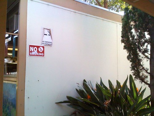
Kevin Hennah's course on library renovations reminded us about how commercial stores have huge signs featuring their identity, and yet so many public buildings - and especially libraries - seem to keep their identity a secret to passersby. The day I started snapping photographs of the library, pre-renovation (this time last year), the very first shot was of our extremely dull, uninformative, external library wall - yes, that all-important wall, seen by every visitor through our main gate. The wall that gives people their first impression of our school:

How would anyone even realise this was the school library?
So, after several fruitless, forlorn visits to both Bunnings' Hardware, and Spotlight, I went off to a local computerised signage supplier for a quote on a speedy-but-weatherproof sign that might impress people coming to my seminar session. The results were a little disappointing: only slightly less than a perspex sign and - no matter what - I'd be spending between $206 and $250 and still only ending up with one external sign.
I did take one source of inspiration from my Bunnings trip: they had some long, pre-primed, stretched canvases for artists @ $35.00. Maybe I could pull off a miracle with a similar stretched canvas, if I could locate one the right size at a local bargain store? Bingo! "Cheaper Than Chips" at Penrith only had one, but it was a 31 x 102 cm "Paintwell" brand stretched canvas @ $15.95, plus $2.00 for a tube of "Ultra Blue" acrylic paint.
Last night, I enlarged some lettering (upper and lower case, for legibility) from Word on the photocopier, transferred the design to the canvas, taped up the straight lines with packaging tape, and started painting - and suddenly there was a completed sign.
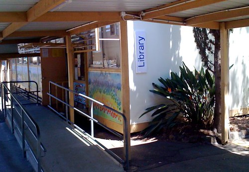
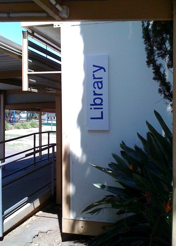
This morning, my clerical assistant helped me cover the canvas with book-covering polythene, which we affixed with a staple gun. I went outside and peeled off the better-quality version of our two "No Smoking" signs, and transferred it to the other end of the wall with fresh double-sided tape. I then used more of the tape to attach my $18 masterpiece to the wall! I've been admiring it every chance I could get today. Please allow me to share:

Today's "photo of the day".
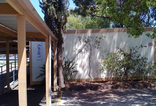
The complete wall, with the "No Smoking" sign at the other end:


No comments:
Post a Comment