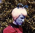
Now, I make this admission as the person who, as a kid in the 60s, had a
huge argument with his parents and siblings about the eventual introduction of colour TV to Australia (it didn't arrive here until 1975). But I was able to see green on black and white cartoons all through my childhood!
The day I realised that specific tone of "green" was actually grey, was... an eye-opener. I still have very distinct memories of watching Fred Flintstone mowing his luxurious
green lawn around his cave house (with an inverted prehistoric stork-looking bird as a mower, of course). But it was all an illusion.
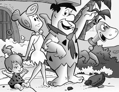
The Flintstones - in glorious black, white and green
It certainly explained why, when colouring in, I often had to study the differences between my blue and purple pencils, my brown and black pencils, and - shudder - my green and orange pencils. (Luckily I didn't have access to grey pencils - not until I advanced to those bigger tinned sets of Lakeland Coloured Pencils in primary school.) I could spend several minutes intently comparing sky blue against violet - and end up colouring the entire sky in my picture... mauve. That happened many times. (Teachers thought I was very "creative".)
Then there was the day in 1970, when I was taken to get my eyes checked, and my first pair of glasses. That I needed glasses to improve my long sight was obvious, but the ophthalmic surgeon, and my mother, were puzzled when he asked me to tell him when a certain light changed from green to red - and I said nothing for the longest time. I was only seeing an orange light, you see, so I couldn't even work out where I was supposed to be looking. Ooops.
They didn't bother doing actual colour blindness tests on me because, as the doctor said, there is no "cure", so what was the point? With a smirk, he also said, to my mum and me, and that if only I'd been at his office a few weeks earlier. He had been given a coloured poster of a woman in a bikini. Apparently colour blind people couldn't see the bikini! (Try having
that discussion in front of an eleven year old boy today and getting away with it.)
I lost my job as a golf caddy when my Dad and his golfing buddies switched to those fluoro orange golf balls in the 70s.
"Where's my ball, caddy?" my Dad's mate would say.
"I dunno", I'd scratch my head, even if the ball was at my feet!
"Help him," my Dad would tell my brother, who still claims he's not colour blind (if I recall correctly).
"I can't see it either!" my brother would say.
Yes, colour blindness often runs in the family.
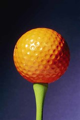
Mmmm, what colour is this tee, I wonder?
My next memorably embarrassing moment was my first term at teachers college in 1977. The science lab had a rectangular poster with coloured spots which spelled out the word '
onion'. I puzzled over this sign for the whole term and, eventually, curiosity got the better of me and I asked the lecturer (in front of the class) why a poster which said '
onion' needed to be on the wall of a science lab.
"Because if you weren't colour blind," said Barry, "it would read '
color'."
I looked back at the poster, and suddenly it read '
color'. D'oh!
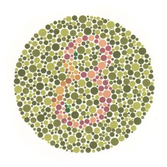
Please don't tell me this spot pattern says something rude...
Just when I thought I had a handle on things, my class of Year 3 students were in hysterics one day. We'd made these wonderful cut and paste patterns using two contrasting colours of Brennex paper squares (ie. school Origami paper, in many, many solid hues). I was up on a ladder pinning up their efforts, then climbed down so we could critique everyone's work from a distance. I ending up accusing some poor kid of handing me a plain sheet of paper to pin up. Her design was lime green on orange, or was it orange on lime green? Sadly, its magnificent effect was totally lost on me.
Even the green/grey problem came back to haunt me in adult life. When I was working at the State Office of the NSW DET, seconded as editor of "Scan", I had my new computer monitor set on what I assumed was the neutral grey background. It stayed that colour for many months, even after my cute "houndstooth of hounds pattern" screensaver overlay disappeared in an upgrade of our server. A colleague from another building was passing through the office and asked me if green was my favourite colour.
"Huh?" I wondered, checking my clothes and various belongings. But she was pointing to the screen I'd lived with all that time - and suddenly I could perceive it as a vivid
grass green - rather the same colour as Fred Flintstone's lawn, actually!
Every now and then, colour blindness becomes a real issue when web surfing. I've had to force myself to identify many reds and greens that give me trouble, but I hate it when some web designer or blogger decides on a wonderful combination of, say lime green and funky orange, which, of course, are
totally opposite on the colour wheel and
should be
contrasting colours, but are identical in wave length to my eyes/brain. If someone puts red-hued writing on a green background, or vice versa, I probably won't even notice the writing is there.
I have been known to have trouble with combinations such as black/brown, blue/purple and yellow/tan. To others these are combinations which are of high contrast. Similarly, some sites will have an override on their
underlined hyperlinks and
visited links, or they'll use
colours instead of underlines, and the site becomes absolutely useless to me. Some WordPress templates/themes are terrible in this way.
Do I tell people the truth about their tricky colour combinations? Definitely, if I think it's an easily fixable problem - or if I plan to return to the site often for content reasons.
Please, have pity on the colour blind. We know not what we see.
Sunday's not so magic number: 96.9 - I'm depressed. Maybe I'll record this number in orange, on green paper? You can tell that winter's here and the early evenings are getting very nippy for dog-walking. Too many bikkies, not enough walking.

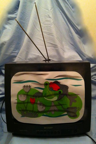 Week 20: Colour
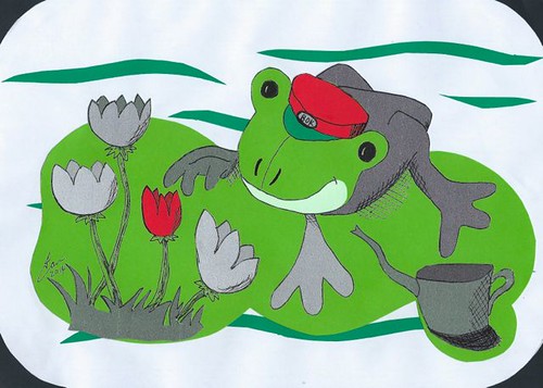 Week 20: Colour II
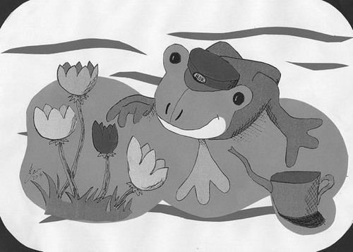
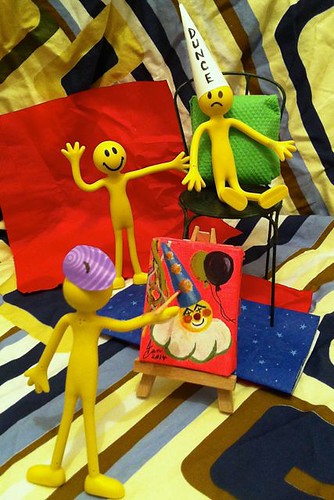 Week 20: Colour III.
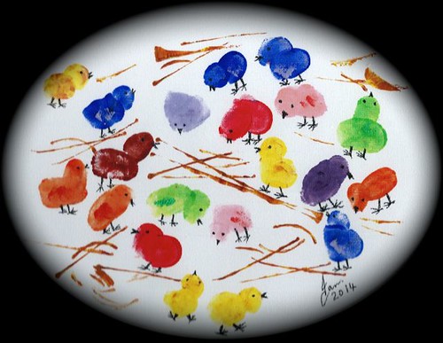 Week 20: Colour IV.

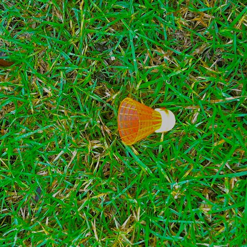


 Posts
Posts